Blog
Integrating a ReactJS Web Component into an IBM DOC/DB Gene Application
IBM DOC/DB Gene reduces the effort required to develop a decision-support solution in many ways. One of them is by allowing ReactJS users to easily create their own widgets for projects built using the IBM DOC/DB Gene platform, which is, itself, developed on Angular.
A ReactJS web component is a self-contained UI element that can be used across different web frameworks and applications. It is designed to be a standalone component that can then be reused in various web development contexts, including non-ReactJS applications. In this way, it can easily be used as an IBM DOC/DB Gene widget.
This article provides information on:
- Publishing a ReactJS web component
- Integrating a ReactJS web component into an IBM DOC/DB Gene application
Prerequisites
To develop and integrate a ReactJS web component into DB Gene, in addition to the application itself, you need the following environment setup:
- NodeJS
- NPM
- Yarn
Publishing a ReactJS Web Component Package for IBM DOC/DB Gene
A ReactJS web component typically consists of:
- A ReactJS component logic that defines the component’s behavior and dynamic content. This includes setting the component states, handling user interactions, and rendering JSX (JavaScript XML) to create the UI. In this article, we will use TypeScript TSX, which is more robust and less error-prone.
- Styling that controls your web component’s appearance through CSS. Styling can be encapsulated within the web component to prevent conflicts with the external styles of the application.
- Props and attributes that allow passing data and configuration to the component. Attributes from the web component can be transferred to the ReactJS component via its props.
- Custom events that the web components can emit to communicate with their parent or host application. These events can be handled by the parent application to trigger specific actions.
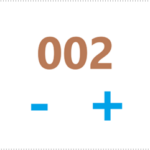
The following sections exemplify creating and publishing a ReactJS web component for IBM DOC/DB Gene: a simple counter with increase and decrease buttons to change its value.
Creating the Project Package
Packaging a web component makes it easier to distribute and install on different applications. Once published, the package can then be integrated into a DB Gene application using Yarn.

Initializing the Package
If you start developing your web component from scratch, you will need to initialize an NPM package for the web component.
You can skip the following initializing command and customize your package as long as it includes the right directories, dependencies, and configurations.
None

npm init
npm init is a command used to initialize a new Node.js project and create a package.json file. The package.json file serves as a configuration file for your Node.js project. It contains information about your project, its dependencies, and various settings. When you run npm init, you’ll be prompted to answer a series of questions to set up your project’s initial configuration.
The command npm init:
- Creates a package.json file in the root directory of your project. This file is crucial for managing your project’s dependencies, scripts, and metadata.
- Asks questions about your project, such as its name, version, description, entry point, test command, Git repository, author, and license. You can provide answers to these questions or accept the default values by pressing Enter. In this example, the project and directory name is my-counter-web-component.
- Generates the package.json content based on your responses to the questions. This content includes key-value pairs with information about your project.
- Displays the summary after you’ve answered the questions or accepted the default values to ensure that your project configuration is correct.
- Finishes initialization of package.json as you confirm the configuration. Your project is then ready.
Adding the Directories dist and src
In addition to the project files, create the directories dist and src in the main directory my-counter-web-component.
None
mkdir dist
mkdir src
Adding the Dependencies
Let’s install our dependencies: react, obviously; webpack, to help us pack the component; a few webpack plugins to manage CSS files; and finally, typescript, its webpack plugin, and typings for react.
From the main directory my-counter-web-component, use a CLI and type the following commands:
None
npm install react react-dom
npm install webpack webpack-cli
npm install sass sass-loader css-loader
npm install ts-loader typescript @types/react @types/react-dom
# or if you're using yarn
yarn add react react-dom @types/react @types/react-dom
yarn add webpack webpack-cli
yarn add sass sass-loader css-loader
yarn add ts-loader typescript
Configuring Typescript
From the main directory my-counter-web-component, create the file tsconfig.json using the following command.
None
npx tsc --init
Edit the file to set the following properties:
None
{
"compilerOptions": {
// allows React jsx notation in source files
"jsx": "react",
// emit declaration files (our package typings)
"declaration": true,
// where to emit the declaration files
"declarationDir": "dist/types"
},
// where to find the source files
"include": [
"src/*"
]
}
Adding src/global.d.ts
With webpack, we can use import statements to indicate which external resources we want to use. In our case, we have some .scss files that we want to include in our project. We will configure webpack in the next section on how to load those files. But first, we must tell TypeScript that .scss files can be loaded, otherwise, we would get an error.
In the directory my-counter-web-component/src, create the file global.d.ts with the following content:
None
/**
* Allows typescript to load scss files, and get their content via webpack-css-loader
*/
declare module "*.scss";
Adding webpack.config.js
webpack allows building the project. In this example,
- The entry point here is index.tsx, and the output is located in the dist directory.
- All .tsx files will be transpiled into .js files, and .scss files into .css files.
In the project directory my-counter-web-component, create the file webpack.config.js with the following content.
None
const path = require("path");
module.exports = {
context: path.join(__dirname, 'src'),
entry: "./index.tsx",
mode: "development",
module: {
rules: [
// typescript transpiling to js
{
test: /\.tsx?$/,
use: 'ts-loader',
exclude: /node_modules/,
},
// scss transpiling to css
{
test: /\.s[ac]ss$/i,
use: ["css-loader", "sass-loader"]
}
]
},
resolve: { extensions: ['.tsx', '.ts', '...'] },
output: {
path: path.resolve(__dirname, "dist/"),
publicPath: "/dist/",
filename: "bundle.js",
library: { type: 'commonjs' },
},
};
Editing package.json
In the file my-counter-web-component/package.json, edit the properties scripts, main, and types as follows:
None
{
// ...
"main": "dist/bundle.js",
"types": "dist/types/index.d.ts",
"scripts": {
"build": "webpack --mode production"
}
}
Checking the Project Structure
After all the modifications, the project structure should look like this:
None
my-counter-web-component
├─ dist/ # compiled project
├─ node_modules/ # js dependencies
├─ src/ # source directory
│ └─ global.d.ts # global typescript definition file
├─ package.json # package definition file
├─ tsconfig.json # typescript config file
├─ webpack.config.js # webpack config file
└─ yarn.lock # yarn dependency lock file
Creating the Component
Before diving into the creation of a ReactJS web component that integrates into a Gene application, let’s begin by building the foundation – a ReactJS component itself.
This section details how to create a simple interactive Counter with two buttons that increment and decrement its value.
Once we have this ReactJS component in place, we’ll proceed to transform it into a reusable web component that can be embedded within a DB Gene application.
Adding src/Counter.tsx
This sample ReactJS component emits an onChange event when the value changes and accepts a description string, as listed in the interface CounterProps.
In the directory my-counter-web-component/src, create the file Counter.tsx with the following content:
None
import React, {FC, useState} from "react";
interface CounterProps {
description?: string;
onChange?: (count: number) => any
}
export const Counter: FC<CounterProps> = ({description, onChange}) => {
const [count, setCount] = useState(0);
function change(amount: number) {
setCount(count + amount);
onChange?.(count + amount);
}
return <div className="counter">
<div className="description">{description}</div>
<div>
<button className="decrease" onClick={() =>
change(-1)}>-</button>
<span className="count">{count}</span>
<button className="increase" onClick={() =>
change(+1)}>+</button>
</div>
</div>;
}
Adding src/Counter.css
Our sample ReactJS component can be customized via a dedicated stylesheet.
In the directory my-counter-web-component/src, create the file Counter.scss with the following content:
None
.counter {
text-align: center;
.description {
font-weight: bold;
}
.count {
color: green;
font-size: 1.5rem;
}
.decrease, .increase {
background: none;
border: none;
color: blue;
font-size: 1.5em;
cursor: pointer;
}
}
Creating the Web Component
The web component is the interface that ensures the interaction between
- the main ReactJS component, whose creation is detailed above, and
- its environment in use, here the Angular-based IBM DOC/DB Gene application.

Adding CounterWebComponent.ts
In the directory my-counter-web-component/src, create the file CounterWebComponent.ts with the following content:
None
import React from "react";
import ReactDom from "react-dom/client";
import {Counter} from "./Counter";
import css from './Counter.scss';
export class CounterWebComponent extends HTMLElement {
private _root: ReactDom.Root | undefined;
private _description?: string;
get description() {
return this._description;
}
set description(description) {
this._description = description;
this.render();
}
connectedCallback() {
const shadowRoot = this.attachShadow({mode: "closed"});
shadowRoot.append(this.createStyle(css));
this._root = ReactDom.createRoot(shadowRoot);
this.render();
}
disconnectedCallback() {
this._root?.unmount();
delete this._root;
}
render() {
if (!this._root) return;
const { description } = this;
const element = React.createElement(
Counter,
{
description,
onChange: (detail: number) =>
this.dispatchEvent(
new CustomEvent('onChange', { detail })
),
}
)
this._root.render(element);
}
private createStyle(css: string) {
const style = document.createElement('style');
style.textContent = css;
return style;
}
}
customElements.define("counter-web-component", CounterWebComponent);
Let’s break down this file and explain each part.
None
export class CounterWebComponent extends HTMLElement {
Here, we declare and export our web component, and we extend HTMLElement as required when creating a web component.
None
private _root: ReactDom.Root | undefined;
Then, we declare the React DOM root. This property will be set and used later to render the React component.
None
private _description?: string;
get description() {
return this._description;
}
set description(description) {
this._description = description;
this.render();
}
Above, we declare a “getter/setter” for the description property. In the setter, we call the render() method. This way, we can re-render the component when the inputs change.
Alternatively, we could handle the inputs via the web component element attributes. See the chapter Handling Inputs via Attributes for more information.
None
connectedCallback() {
const shadowRoot = this.attachShadow({mode: "closed"});
shadowRoot.append(this.createStyle(css));
this._root = ReactDom.createRoot(shadowRoot);
this.render();
}
The connectedCallback() method is a web component lifecycle callback. It is called when the web component is appended to a document (i.e., upon creation).
In this method:
- We create a closed shadow root for our web component. This will allow total isolation from the host page, preventing the host page styling from polluting our component.
- Then, we add our component style to the shadow root and initialize the React DOM root to use said shadow root.
- Finally, we render the component.
None
disconnectedCallback() {
this._root?.unmount();
delete this._root;
}
The disconnectedCallback() method is another web component lifecycle callback called when the web component is removed from the document. It simply unmounts the ReactJS component.
None
render() {
if (!this._root) return;
const { description } = this;
const element = React.createElement(
Counter,
{
description,
onChange: (detail: number) =>
this.dispatchEvent(
new CustomEvent('onChange', { detail })
),
}
)
this._root.render(element);
}
The render() method is responsible for rendering our component. To do so, we need to gather the inputs of our web component, prepare the output callbacks, and pass them to the ReactJS component.
The onChange callback is called in the ReactJS component when the counter value is updated. When called, we will dispatch a CustomEvent on our web component. This CustomEvent can be listened to, like other native events in Angular:
None
<counter-web-component (onChange)="handleChange($event.detail)"></counter-web-component>
Custom events can hold a custom value in their detail property. Therefore, we will use this property to communicate the new value of the counter to Angular.
None
private createStyle(css: string) {
const style = document.createElement('style');
style.textContent = css;
return style;
}
The helper method createStyle() simply creates the style element, sets its content to the content of our style file, and returns the element. See Managing Style Inheritance for alternative ways to integrate styling into the web component.
None
customElements.define("counter-web-component", CounterWebComponent);
Finally, we register the web component as a custom element in the browser under a tag name.
Managing Style Inheritance
If we want to benefit from the styling of the host page of our web component, we need to remove the shadow root of our web component and instead render the ReactJS component directly under our web component. The stylesheet then needs to be emitted separately from the web component and imported explicitly in the host application.
We can do this by first rewriting the connectedCallback() method:
None
connectedCallback() {
this._root = ReactDom.createRoot(this);
this.render();
}
To emit the .css file in your package, we can use mini-css-extract-plugin.
From the main directory my-counter-web-component, install the plugin using the following command:
None
npm install mini-css-extract-plugin
# or if you're using yarn
yarn add mini-css-extract-plugin
Then edit the file my-counter-web-component/webpack.config.js as follows:
None
const MiniCssExtractPlugin = require("mini-css-extract-plugin");
module.exports = {
// ...
plugins: [new MiniCssExtractPlugin()],
module: {
rules: [
// ...
{
test: /\.s[ac]ss$/i,
use: [MiniCssExtractPlugin.loader, "css-loader", "sass-loader"]
}
]
}
};
Finally, in the file web/angular.json located at the root of the DB Gene application, specify the emitted .css file as follows:
None
{
"projects": {
"web-client": {
"architect": {
"build": {
"options": {
"styles": [
// ...
"node_modules/my-counter-web-component/dist/main.css",
]
}
}
}
}
}
}
Handling Inputs via Attributes
Instead of handling inputs via the property accessor, one can use attribute inputs. However, only strings can be passed this way.
In Angular, our description input can be set using attributes or data binding.
None
<counter-web-component description="hello"></counter-web-component>
<!-- or -->
<counter-web-component [attr.description]="'hello'"></counter-web-component>
To do so, we first need to add a static get observedAttributes() method that returns an array of the attributes we want to observe, as well as a new lifecycle callback attributeChangedCallback that will be called every time an attribute we observe changes.
This callback will be called with:
- the name of the modified attribute,
- its value before modification, and
- its new value.
We won’t use those values here, but they could be used, for example, to verify if the value changed.
To handle inputs via attributes, edit the file my-counter-web-component/src/CounterWebComponent.ts as follows:
None
export class CounterWebComponent extends HTMLElement {
static get observedAttributes() {
return ['description'];
}
attributeChangedCallback(name: string, oldValue: string, newValue: string) {
this.render();
}
// [...]
}
Edit the same file so all the inputs that changed are gathered in the method render() to be passed to the ReactJS component as follows:
None
export class CounterWebComponent extends HTMLElement {
// [...]
render() {
// [...]
// const { description } = this; // <- before
const description = this.attributes.getNamedItem('description')?.value; // <- after
// [...]
}
}
Building and Publishing the Web Component
Once the web component is properly created, it is time to build it and publish the resulting package so it can be easily imported into the IBM DOC/DB Gene application.
Exporting the Web Component
We need to export the web component so it can be used in the application.
In the directory my-counter-web-component/src, create the file index.tsx with the following content:
None
export { CounterWebComponent } from './CounterWebComponent';
Building the Web Component
From the directory my-counter-web-component, build your web component using the following command:
None
npm run build
# or if you’re using yarn
yarn build
Publishing the Package
From the directory my-counter-web-component, publish the package using the following command:
None
npm publish --registry https://registry.npmjs.org
To publish to a private registry, replace https://registry.npmjs.org with the URL of your private registry.
To preview what will be published, add –dry-run to the command.
To exclude files or directories from the published package, create a .npmignore file. It works like a .gitignore file, so if we do not want to publish the source files and build process alongside the build, we could edit it as follows:
None
src/
tsconfig.json
webpack.config.js
yarn.lock
Importing a ReactJS Web Component Package into an IBM DOC/DB Gene application
After publishing your web component to the public registry https://registry.npmjs.org, you can import it into an IBM DOC/DB Gene application.
Adding the Web Component to IBM DOC/DB Gene
Once the ReactJS Web Component is published, it can easily be added to an IBM DOC/DB Gene application. In this article, the application root directory is my-project.
From the directory my-project/web, add the web component to the application using the following command:
None
npm install my-counter-web-component
# or if you're using yarn
yarn add my-counter-web-component
Using the Web Component within IBM DOC/DB Gene
After adding the web component to an IBM DOC/DB Gene application, you can use it wherever HTML is accepted. To do so:
- The web component must be imported at least once using import “my-counter-web-component”.
- If used in a component template, make sure to allow custom elements in the Angular module of your component as follows:
None
@NgModule({
declarations: [/* ... */],
imports: [/* ... */],
schemas: [CUSTOM_ELEMENTS_SCHEMA], // allow custom elements
})
One way to use a ReactJS web component within IBM DOC/DB Gene is by creating a custom widget that displays it. For more details on how to create a custom widget for IBM DOC/DB Gene in Angular, please refer to the Platform Documentation.
In the application, several sample widgets already exist in the folder my-project/web/src/app/modules/sample-widgets from which you can take inspiration.
Create the file my-project/web/src/app/modules/sample-widgets/my-counter-web-component.ts with the following content:
None
import "my-counter-web-component";
import { Component, CUSTOM_ELEMENTS_SCHEMA, NgModule } from "@angular/core";
import { GeneCustomWidgetFactoryService, GeneWidgetManifest } from "@gene/widget-core";
@Component({
template: `
<counter-web-component
[description]="description"
(onChange)="handleChange($event.detail)"
></counter-web-component>
`,
styles: [`
:host {
width: 100%;
height: 100%;
display: flex;
overflow: auto;
justify-content: center;
align-items: center;
}
`],
standalone: false,
})
export class CounterWidget {
static MANIFEST: GeneWidgetManifest = {
name: 'Counter Widget',
widgetTypeName: 'CounterWidget',
description: 'a simple counter widget',
dashboardCompatible: true,
customViewCompatible: true,
itemCols: 3,
itemRows: 2,
}
description = 'Counter description';
handleChange(count: number) {
console.log(`count is at ${count}`);
}
}
@NgModule({
declarations: [CounterWidget],
schemas: [CUSTOM_ELEMENTS_SCHEMA],
})
export class CounterWidgetModule {
constructor(customWidgetFactory: GeneCustomWidgetFactoryService) {
customWidgetFactory.registerWidget(CounterWidget.MANIFEST, CounterWidget);
}
}
Then add the CounterWidgetModule to the import array of web/src/app/modules/sample-widgets/sample-widgets.module.ts
CounterWidget is a minimalist IBM DOC/DB Gene custom widget that displays the web component, which, itself, contains the ReactJS component we created in this article.
Now you can use all the information above to create your own ReactJS web component, embed it in a custom widget, and use it in your application.

Florian Olivier André
Full Stack Senior Developer
About the Author
Florian Olivier-André is a Full Stack Senior Developer with 15 years of experience in software development, with a strong focus on frontend technologies. He has been with DecisionBrain for the past 3 years, contributing to the design and implementation of user-centric interfaces for the IBM DOC / DB Gene platform. Florian holds a Licence in Web and Multimedia from the IUT of Bobigny and is passionate about creating intuitive, high-performance user experiences. You can reach Florian at: [email protected]
At DecisionBrain, we deliver AI-driven decision-support solutions that empower organizations to achieve operational excellence by enhancing efficiency and competitiveness. Whether you’re facing simple challenges or complex problems, our modular planning and scheduling optimization solutions for manufacturing, supply chain, logistics, workforce, and maintenance are designed to meet your specific needs. Backed by over 400 person-years of expertise in machine learning, operations research, and mathematical optimization, we deliver tailored decision support systems where standard packaged applications fall short. Contact us to discover how we can support your business!
Read also